Login / Register
 Bath
Bath Study & Office
 Dining
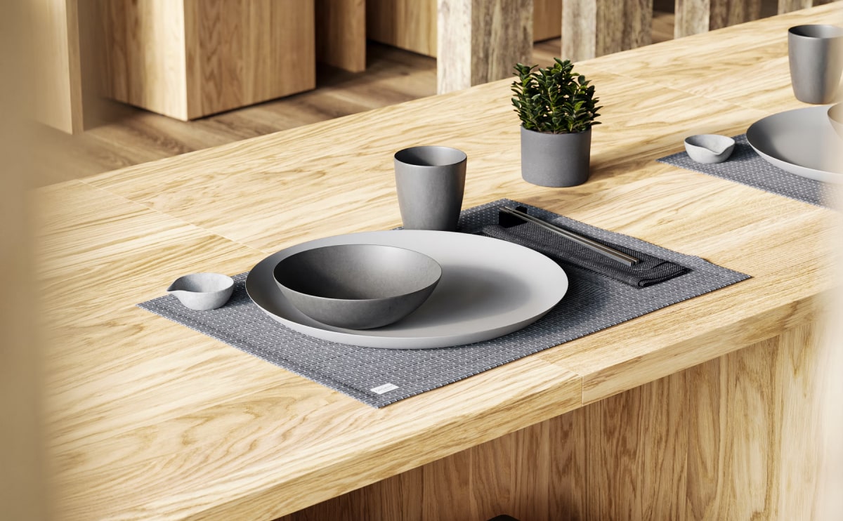
 Ceiling Design
Ethimo mountain style

So how did the classical Latin become so incoherent? According to McClintock, a 15th century typesetter likely scrambled part of Cicero’s De Finibus in order to provide placeholder text to mockup various fonts for a type specimen book. It’s difficult to find examples of lorem ipsum in use before Letraset made it popular as a dummy text in the 1960s, although McClintock says he remembers coming across the lorem ipsum passage in a book of old metal type samples. So far he hasn’t relocated where he once saw the passage, but the popularity of Cicero in the 15th century supports the theory that the filler text has been used for centuries.
Don’t bother typing “lorem ipsum” into Google translate. If you already tried, you may have gotten anything from “NATO” to “China”, depending on how you capitalized the letters. The bizarre translation was fodder for conspiracy theories, but Google has since updated its “lorem ipsum” translation to, boringly enough, “lorem ipsum”. One brave soul did take a stab at translating the almost-not-quite-Latin.
According to The Guardian, Jaspreet Singh Boparai undertook the challenge with the goal of making the text “precisely as incoherent in English as it is in Latin – and to make it incoherent in the same way”. As a result, “the Greek ‘eu’ in Latin became the French ‘bien’ […] and the ‘-ing’ ending in ‘lorem ipsum’ seemed best rendered by an ‘-iendum’ in English.”

Find Your Focus While Working
As an alternative theory, (and because Latin scholars do this sort of thing) someone tracked down a 1914 Latin edition of De Finibus which challenges McClintock’s 15th century claims and suggests that the dawn of lorem ipsum was as recent as the 20th century. The 1914 Loeb Classical Library Edition ran out of room on page 34 for the Latin phrase “dolorem ipsum” (sorrow in itself). Thus, the truncated phrase leaves one page dangling with “do-”, while another begins with the now ubiquitous “lorem ipsum”.
Whether a medieval typesetter chose to garble a well-known (but non-Biblical—that would have been sacrilegious) text, or whether a quirk in the 1914 Loeb Edition inspired a graphic designer, it’s admittedly an odd way for Cicero to sail into the 21st century.
-10%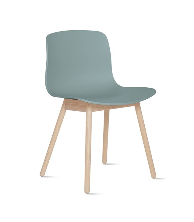
Compare
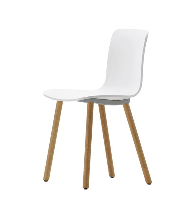
12 side
Chairs
$339
Soft curves and tapering slender lines are inspired by modern design. The result is a classic yet contemporary chair, ideally combined with the table by the same name
Add to wishlist
Add to cart
Quick view
Compare
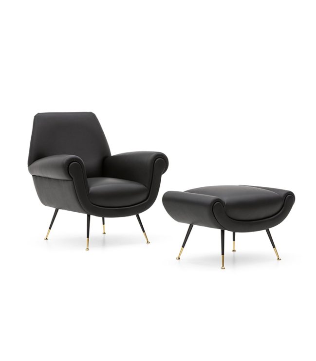
Albert
Armchairs
$1.600
Rated 5.00 out of 5
The compact and well-proportioned silhouette of both the seats and the small sofa, opens up to a new way of using the dining space: as a living room within the living room, a hybrid situation.
Add to wishlist
Select options
Quick view

Compare
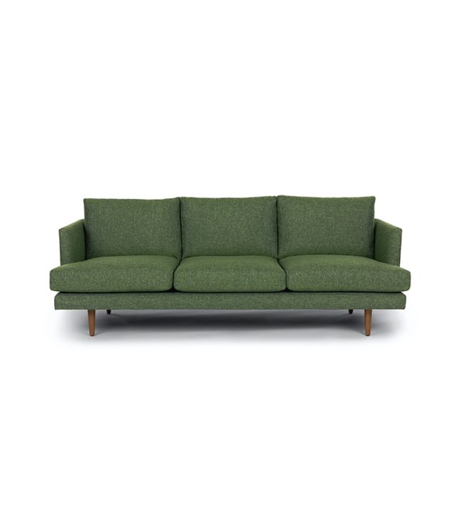
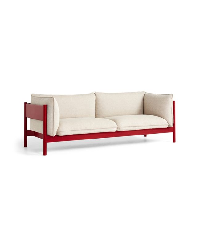
Arbour
Sofas
$1.900
The slender organic forms are fluid and graceful. Noguchi emphasises the lightness of the elements with thin yet comfortable upholstery and a choice of cover fabrics in natural colours.
Add to wishlist
Select options
Quick view
Compare
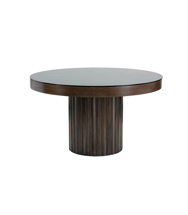
Aruda
Tables
$699
Rated 5.00 out of 5
A new classic for the contemporary dining room, the Mondrian table reinterprets the light and elegant design of the sofa and coffee table collection of the same name
Add to wishlist
Add to cart
Quick view